Mendeley Analytics – part 2

After breaking into the simple Mendeley Database to obtain the most frequent authors and co-authors I started another attemt to rank the journals by it occurance. The resulting bubble visualisation is not the best reprsentation to quickly grasp the information but it gives you an overview on how focused your literature collection is. In my case I realised the brought span of collected journals. Even the most frequent journals do not count more then 11 articles.

The result can help to fell a decision of the right journal in order to avoid reviewer comments like „Also, you often cited other technology journals, but only cited one source from our journal. You may want to consider submitting to a journal that you cited most often in your paper“.
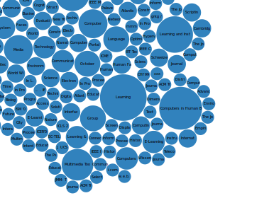
Bubbles of journals in my mendeley database ranked by the number of articles.


By analysing the data I found another prupose to use the database. Due Mendeley does not offer any function to valitdate completness of meta data such a features could be implemented outside of the Desktop application. By BibTex to render the citations I usually get complains about missing attributes.
Mendeley Analytics – part 1: Data Visualization for collected Publications in Mendeley

Mendeley is valuable tool to organize and annotate scientific literature. As power user you can get lost in paper space because Mendeley does not offer any tools keep track with all the collected metadata. Having more then 500 articles, book chapters and books in your collection makes it quiet difficult to overview relationships between authors/co-authors, publishers and keywords.
Luckily Mendeley does not protect its local database on desktop computers. So its theoreticly possible to build an alternative to Mendeley but for the mentioned disadvantage its fare enough to collect some resonable data for meaningful visualisations.
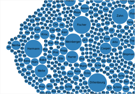
As a first example I will present some source code and visualization that gives you an overview about the quantity of authors and co-authors. Especially co-authors do not get that much attention while they play an important role, e.g. as senior scientist that tie generations of young researchers together.

A snapshot of my Mendeley Database produced these bubbles representing authors of my collected publications.

Surprisingly I discovered some new names that seem to play a bigger role in my research filed as expected.

Technically the visualization is based on a simple bubble chart from the D3.js examples. The SQLite-Database can easily viewed with tools like “SQLite Database Browser”, available for Linux. The conversion of the data could be done with the script language of your choice. I put in php to generate some json code for D3:
< ?php header('Content-Type: application/json'); if ($db = new SQLite3('your-mendeley-sqlite-file')) { $result = $db->query('SELECT lastName, firstNames FROM DocumentContributors');
$row = array();
$i = 0;
while($res = $result->fetchArray(SQLITE3_ASSOC)){
$row[$res['lastName']] ++;
$i++;
}
$data = array('name' => "flare");
$authors = array();
foreach($row as $key => $val){
array_push($authors, array('name' => $key, 'size' => $val););
}
$data['children'] = $authors;
echo json_encode($data);
} else {
die($err);
}
?>