ACD3: Video Bubble Charts

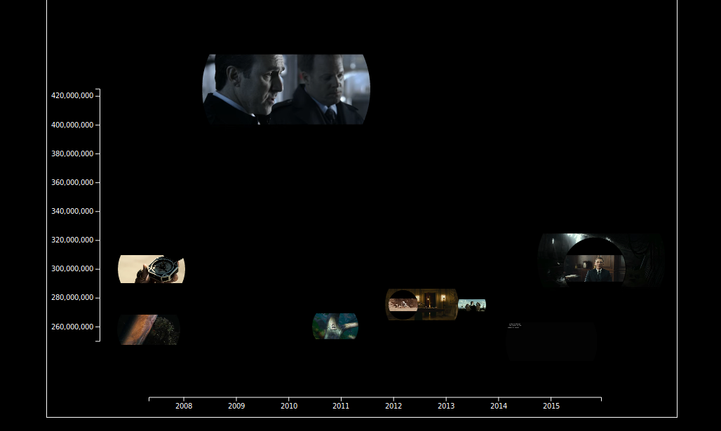
Three guys from ac-d3 published some neat plugin for D3.js for integrating audiovisual content (AC) into data charts (D3). The videos are obtained from YouTube or Vimeo to illustrate the chart content. Presenting and playing multiple videos at once might make no real sense, but it is nice to see some moving images within a bubble chart. So one could use it as tool for remixing different videos into a collage or for more serious data analysis task regarding videos. I am still waiting to see more meaningful example. Unfortunately the browser struggles under the load of simultaneous playing videos. Without this performance problems AC-D3 would be candidate for the Video Learning Dashboard that I am developing at the moment.

The AC-D3 code is available at github.
Mendeley Analytics – part 1: Data Visualization for collected Publications in Mendeley

Mendeley is valuable tool to organize and annotate scientific literature. As power user you can get lost in paper space because Mendeley does not offer any tools keep track with all the collected metadata. Having more then 500 articles, book chapters and books in your collection makes it quiet difficult to overview relationships between authors/co-authors, publishers and keywords.
Luckily Mendeley does not protect its local database on desktop computers. So its theoreticly possible to build an alternative to Mendeley but for the mentioned disadvantage its fare enough to collect some resonable data for meaningful visualisations.
As a first example I will present some source code and visualization that gives you an overview about the quantity of authors and co-authors. Especially co-authors do not get that much attention while they play an important role, e.g. as senior scientist that tie generations of young researchers together.

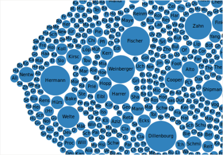
A snapshot of my Mendeley Database produced these bubbles representing authors of my collected publications.

Surprisingly I discovered some new names that seem to play a bigger role in my research filed as expected.

Technically the visualization is based on a simple bubble chart from the D3.js examples. The SQLite-Database can easily viewed with tools like “SQLite Database Browser”, available for Linux. The conversion of the data could be done with the script language of your choice. I put in php to generate some json code for D3:
< ?php header('Content-Type: application/json'); if ($db = new SQLite3('your-mendeley-sqlite-file')) { $result = $db->query('SELECT lastName, firstNames FROM DocumentContributors');
$row = array();
$i = 0;
while($res = $result->fetchArray(SQLITE3_ASSOC)){
$row[$res['lastName']] ++;
$i++;
}
$data = array('name' => "flare");
$authors = array();
foreach($row as $key => $val){
array_push($authors, array('name' => $key, 'size' => $val););
}
$data['children'] = $authors;
echo json_encode($data);
} else {
die($err);
}
?>

Next Generation DataViz: Drawing Dynamic Visualizations

Bret Victor bringt in diesem Stanford HCI-Kurs einen schönen Vergleich zwischen den Tools die einem zur Datenvisualisierung zur Verfügung stehen und den Freiheitgraden beim Schreiben von Texten: Wenn man als Wissenschaftler versucht Daten mit Excel zu visualisieren, dann ist das als gäbe es nur Lükentextvorlagen zum Schreiben eines Papers. Schlüssig erläutert Victor die Nachteile der gegenwärtigen Tools zur Datenvisualisierung:

  • Excel & Co: ist in seinem Ausdrucksformen enorm eingeschränkt
  • Zeichenwerkzeuge wie Adobe Illustrator oder Inkscape sind zu umständlich in der Handhabung, wenn man große Datenmengen bearbeiten möchte
  • Programmierung mit R oder D3 ist, als man versucht blind Objekte zu manipulieren („Programming is blindly manipulationg symbols“)

In dem Video führt er die nächste Generation von Werkzeug vor, mit der man Datensätze mit Standardobjekten (Rechteck, Kreis, Punkt, Linie) manipulieren (Skalieren, Drehen, …) kann. Ein wesentliches Feature stellen dynamische Parameter dar, mit denen man beispielsweise den Neigungswinkel einer Gerade von einem Datensatze abhängig machen kann. Desweiteren führt das Snapping als eine Methode ein, um graphische Elemente (dynamisch) miteinander zu verknüpfen.

Ich kann es jedenfalls kaum erwarten bis das Tool bei github erscheint. Bisweilen gibt dort schon ein ähnliches Tool namens livecoding mit dem man immerhin D3-Code in Echtzeit manipulieren kann.

UPDATE: Bret Victor hat schon mal die Dokumentation der Software ins Netzt gestellt.


Learning Analytics using CORDTRA Diagrams with D3.js

CORDTRA stands for Chronological-Ordered Representation of Discourse or Tool Related Activity. These diagrams consist of a timeline where multiple processes are ploted in parallel. Basically it is scatter plot where activities follow a certain coding scheme. In my example the usage of video annotations was distinguished into different interactions, e.g. using Popcorn Maker or direct annotation authoring or contributing/starting an electronic assessment (quiz). The input data was captured in a logfile containing activity data together with a unix time stamp.

Read More